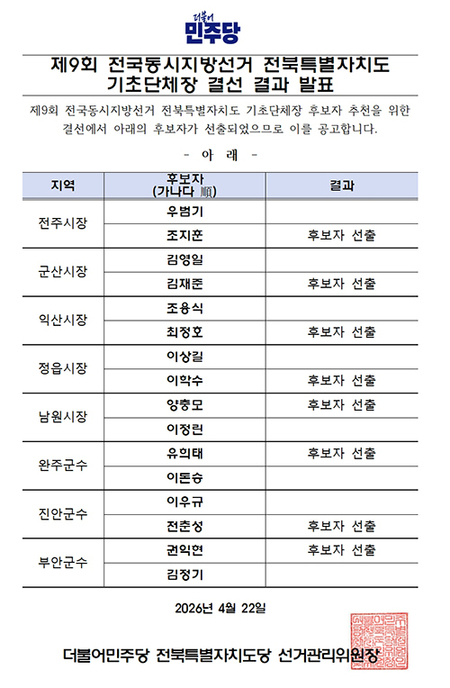
▲ 브레이크뉴스 홈페이지 첫화면. © 브레이크뉴스 |
브레이크뉴스 최애리 기자= 브레이크뉴스는 18일 새해를 맞아 PC판 홈페이지 개편을 단행했다.
새로운 홈페이지는 가독성 향상을 고려해 제작됐다. 다양한 기사를 보다 쉽게 확인할 수 있도록 구조와 디자인을 변경했다.
메인화면 상단은 기존과 같이 정치 및 이슈 분야 기사를 배치해 현재의 중요 이슈들을 가장 먼저 볼 수 있도록 했다.
경제,산업 분야 기사의 경우에는 보다 사이즈를 키워 정보접근성 향상 및 가독성을 끌어 올렸다.
또한 롤링 기능 등을 더해 적은 공간을 차지하며 더 다양한 기사를 노출되도록 수정했다.
문흥수 브레이크뉴스 편집국장은 "이번 개편으로 독자들이 보다 편하게 기사를 읽을 수 있길 기대한다"며 "향후에도 이용자들의 의견을 반영해 지속적으로 개선해 나가겠다"고 말했다.
*아래는 위 기사를 '구글 번역'으로 번역한 영문 기사의 [전문]입니다. '구글번역'은 이해도 높이기를 위해 노력하고 있습니다. 영문 번역에 오류가 있을 수 있음을 전제로 합니다.<*The following is [the full text] of the English article translated by 'Google Translate'. 'Google Translate' is working hard to improve understanding. It is assumed that there may be errors in the English translation.>
Reorganization of the Break News homepage..."Improved readability".
Change structure and design to make it easier to see than many articles
Reporter Choi Ari
On the 18th, Break News carried out a reorganization of its PC version homepage to mark the New Year.
The new homepage was created in consideration of improved readability. The structure and design have been changed to make it easier to check various articles.
At the top of the main screen, articles in the field of politics and issues are placed as before so that the current important issues can be seen first.
In the case of articles in the economic and industrial sectors, the size has been increased to improve information accessibility and readability.
It also added rolling functions to take up less space and modified it to expose more diverse articles.
Moon Heung-soo, editor-in-chief of Break News, said, "We hope that this reorganization will make it easier for readers to read articles," adding, "We will continue to improve it by reflecting users' opinions in the future."